Finove
The goal is to design a mobile app that helps casual users manage their day-to-day finances, track budgets, and oversee savings with ease. The project demonstrates a full design process—from research to high-fidelity wireframes—and showcases my approach to user-centered design and strategic decision-making.
01
Challenge
Personal finance apps often overwhelm users with complex features and information, making it hard for casual users to manage everyday finances intuitively. The goal was to create a streamlined, user-friendly experience that would enable users to set and track budgets, monitor spending, and visualize savings effortlessly.
02
Role
UX Designer / UI Designer
03
Research
Objective: Understand the needs, motivations, and pain points of users who want an overview of their finances without feeling overwhelmed by unnecessary features.
Empathy Mapping: I identified our target segment as casual users who seek simplicity. They want to set a budget, monitor spending trends, and save easily. This process highlighted key user emotions and pain points: they feel anxious about managing finances but are motivated to gain better control.
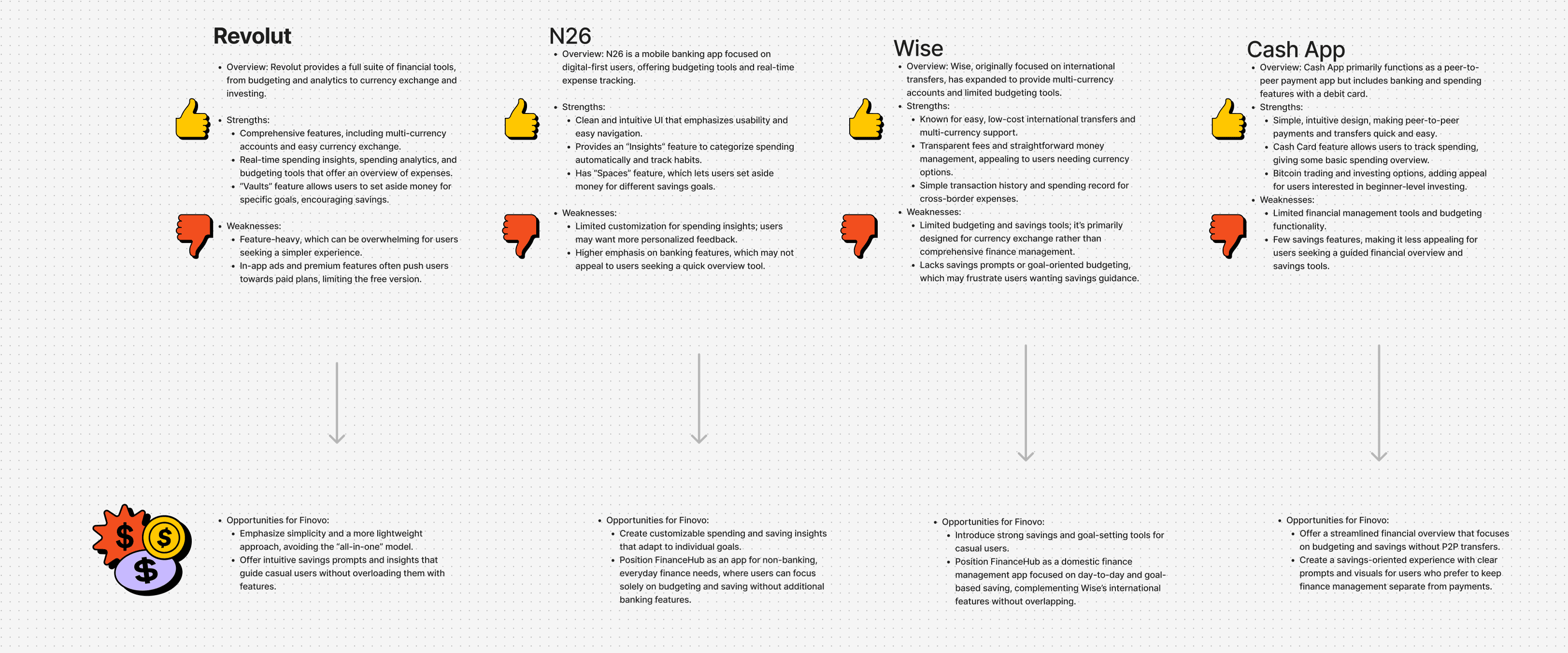
Competitive Analysis: I analyzed leading fintech apps like Revolut, N26, Wise, and Cash App, focusing on what each app does well and areas where they fall short for casual users. While these apps offer powerful tools, they often present complex features that could be intimidating for users simply seeking everyday budgeting help.

04
User Journey
Identify and map out the most important user journeys to focus on in the app.
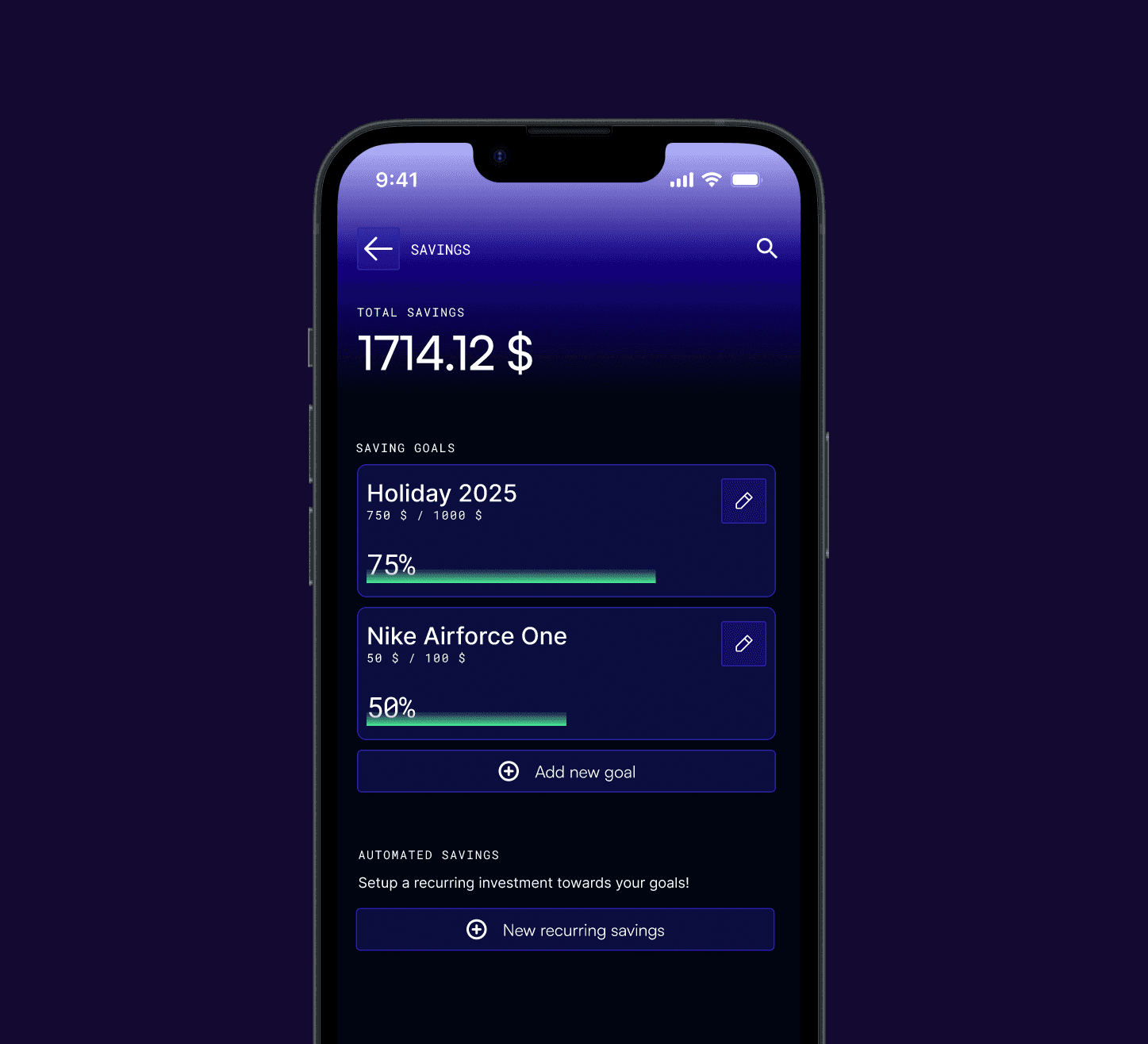
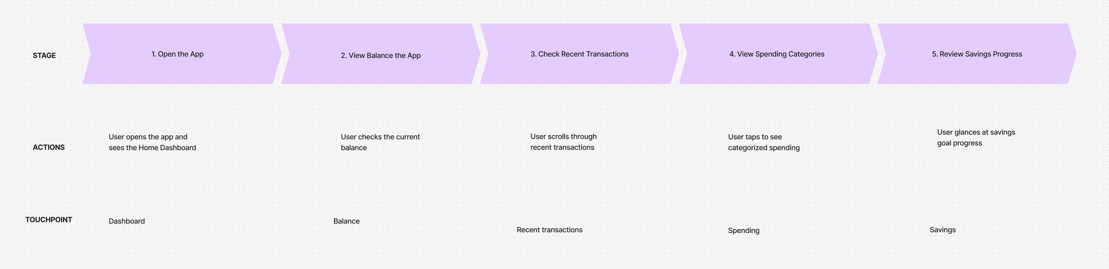
Most Important Journey: Setting and tracking a budget. This journey was mapped in detail to understand the steps, potential pain points, and areas for improvement. It revealed that users needed easy ways to set goals, track their progress, and visualize their budget at a glance.
Key Insight: Simplifying the budget-setting process with easy-to-follow steps and clear progress tracking would help users stay motivated and engaged.
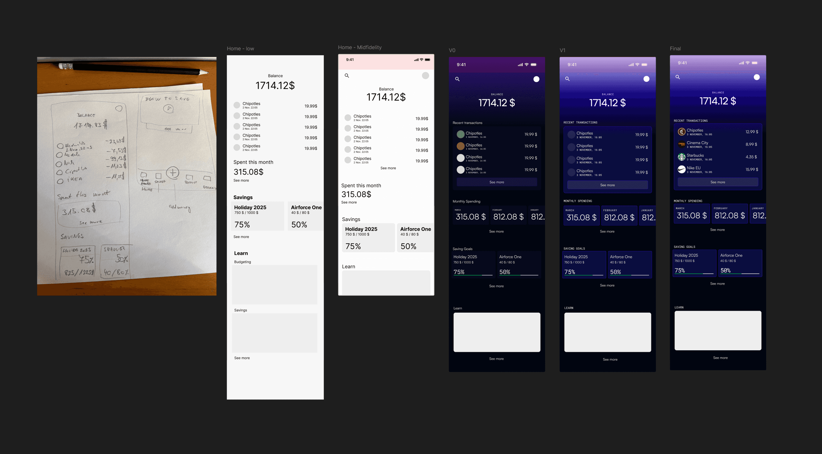
05
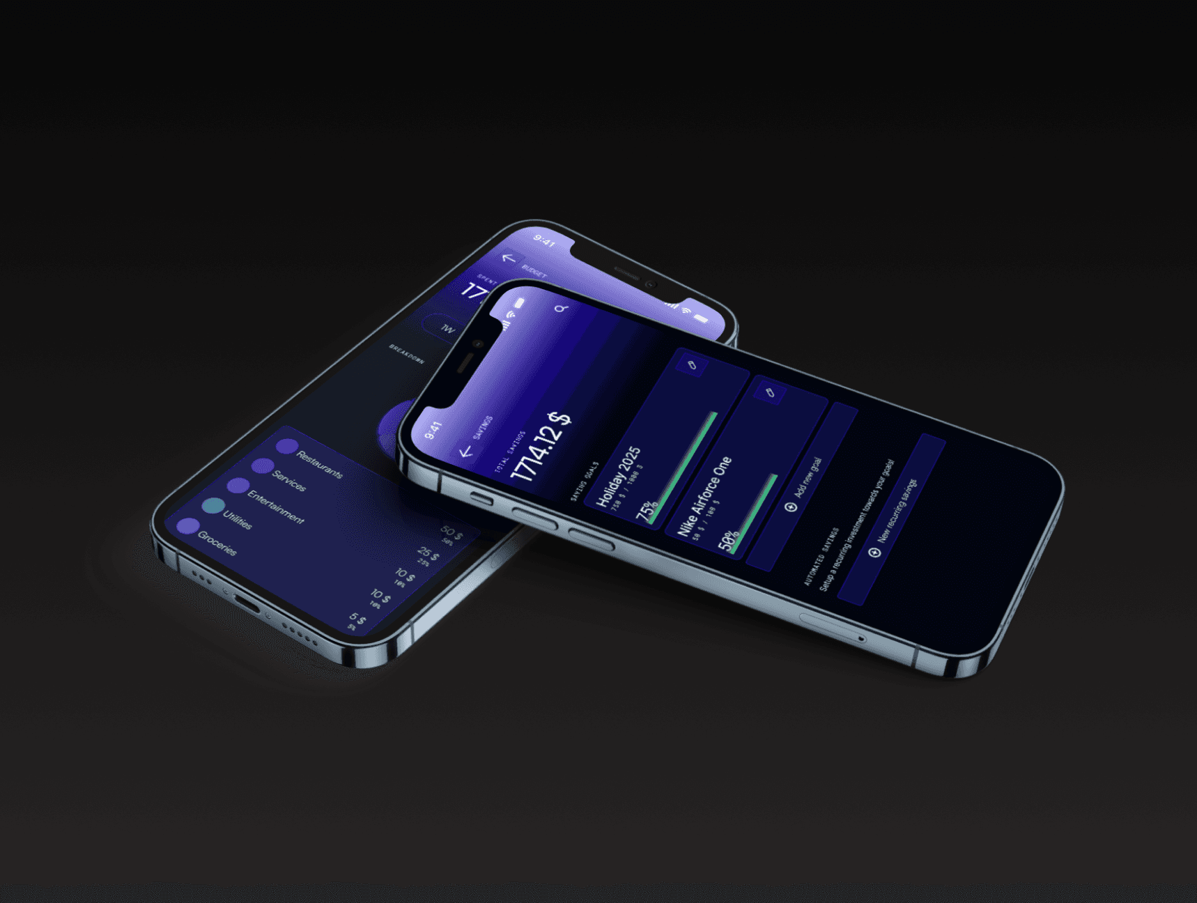
Wireframing
Beginning with low-fidelity wireframes, I sketched out the basic layout, refining it to mid-fidelity to define interactions and user flow more clearly. Each iteration was designed to keep Finove intuitive and visually minimal, helping users navigate effortlessly.